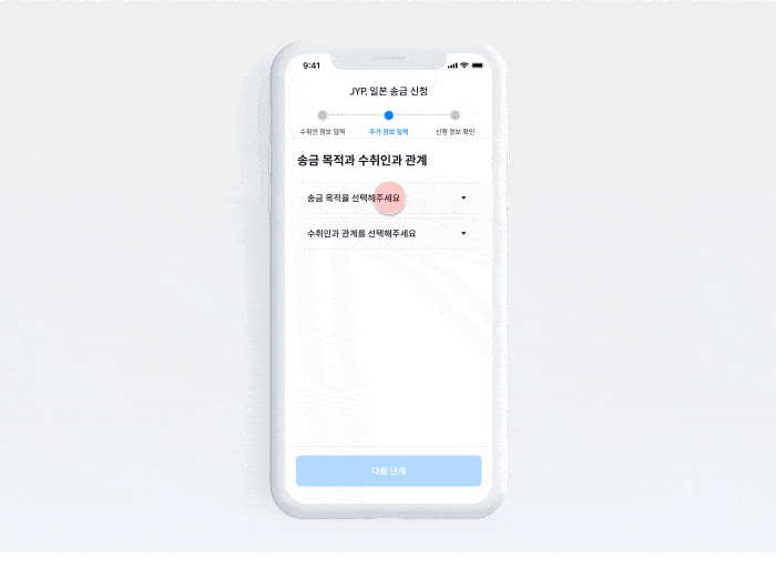
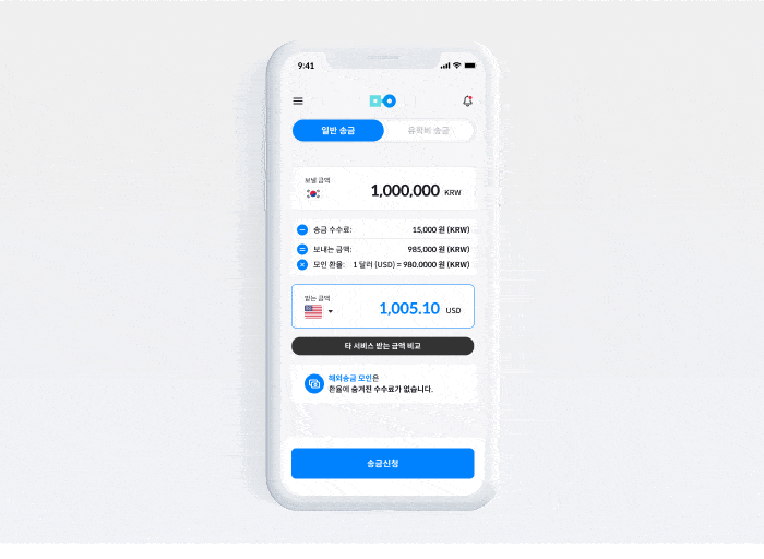
Overview
App Store screenshots are the first touchpoint where potential users encounter the service. The goal of this project was not just aesthetic improvement, but to optimize ASO (App Store Optimization). By intuitively visualizing MOIN’s core value propositions—Speed, Low Fees, and Convenience—I aimed to reduce hesitation and increase the Store-to-Download Conversion Rate (CVR).
앱스토어 스크린샷은 잠재 고객이 서비스를 만나는 첫 번째 접점입니다. 이 프로젝트의 목표는 단순한 심미적 개선이 아닌, ASO(앱 스토어 최적화)였습니다. 모인의 핵심 가치인 '속도', '저렴한 수수료', '편리함'을 직관적으로 시각화하여, 사용자의 망설임을 줄이고 다운로드 전환율(CVR)을 높이는 데 주력했습니다.
Key-strategy
Since mobile users scan through screenshots in seconds, clarity is key. I selected 4 Key Messages based on user research and prioritized them to match user needs.
- Benefit First: Highlighted "0 Fees" and "Max Exchange Rate" in the first image to hook users immediately.
- Speed & Efficiency: Visualized "4x Faster than Banks" to address the biggest pain point of traditional remittance.
- Target Specifics: Emphasized features for "Students" and "Business" to resonate with core user groups.
- Trust & Security: Showcased security certifications to build trust for financial transactions.
모바일 사용자는 몇 초 만에 스크린샷을 훑어보기에 '명확성'이 핵심입니다. 유저 리서치를 기반으로 사용자가 가장 원하는 4가지 핵심 메시지를 선정하고 우선순위를 정했습니다.
- 혜택 우선 노출: 첫 번째 이미지에 '수수료 0원', '최대 환율 우대'를 배치하여 즉각적인 관심을 유도했습니다.
- 속도 강조: 기존 송금의 가장 큰 불만인 속도 문제를 해결하는 '은행보다 4배 빠름'을 시각화했습니다.
- 타겟 구체화: '유학생', '비즈니스' 등 핵심 타겟에게 필요한 기능을 강조하여 공감대를 형성했습니다.
- 신뢰와 보안: 금융 거래의 필수 요소인 보안 인증 내역을 보여주어 신뢰도를 확보했습니다.
Design Execution
Real UI screens often contain too much information, making them hard to read on small devices. To solve this, I used abstraction and emphasis techniques.
- Simplified UI: Instead of using raw screenshots, I redesigned the UI assets to highlight only the relevant data (e.g., Rates, Arrival Time).
- Bold Typography: Used large, bold headlines to ensure the key message is readable even without clicking the image.
- Brand Consistency: Maintained MOIN’s brand colors (Blue & White) to ensure a seamless experience from the App Store to the actual app.
실제 앱 화면은 정보량이 많아 작은 모바일 화면에서는 가독성이 떨어집니다. 이를 해결하기 위해 단순화와 강조 기법을 사용했습니다.
- UI 단순화: 실제 스크린샷을 그대로 쓰는 대신, 강조하고 싶은 데이터(환율, 도착 시간 등)만 잘 보이도록 UI를 재구성했습니다.
- 타이포그래피: 이미지를 클릭하지 않아도 핵심 메시지가 읽히도록 크고 굵은 폰트를 사용했습니다.
- 브랜드 일관성: 모인의 브랜드 컬러(블루&화이트)를 유지하여, 스토어에서 앱 실행으로 이어지는 경험의 일관성을 확보했습니다.
Outcome
Executive Summary
The strategic renewal of the iOS App Store screenshots in June 2022 served as a pivotal turning point for MOIN’s User Acquisition (UA) efficiency. By intuitively visualizing the core values of a fintech service 'Trust' and 'User Benefits'the redesign triggered an immediate surge in organic traffic and successfully drove a 2.5x growth trajectory over a 6 month period.
2022년 6월 진행한 iOS 앱스토어 스크린샷 리뉴얼은 모인(Moin) 서비스의 유저 획득(User Acquisition) 효율을 극적으로 개선하는 변곡점이 되었습니다. 핀테크 서비스의 핵심 가치인 '신뢰'와 '혜택'을 직관적으로 시각화한 전략은 배포 즉시 유입량 급증으로 이어졌으며, 6개월 만에 2.5배 이상의 성장을 기록하는 J-Curve를 그려냈습니다.
Quantitative Impact
- 리뉴얼 적용 시점인 2022년 6월, 전월 대비 45.7% 성장 (2,182 → 3,180)을 기록하며 유입 지표가 상승하였습니다.
- 2.5배 성장 달성: 변경 전(2022.06) 대비 7개월 후(2023.01) 월간 지표가 152% 증가 (2,182 → 5,498)했습니다.
- 베이스라인 레벨업: 2,000대 초반에 머물던 월평균 실적이 하반기에는 4,000대 이상으로 안착하며 서비스 규모 자체가 확장되었습니다.
- Upon implementation in June 2022, the metrics surged by 45.7% MoM (2,182 → 3,180), effectively breaking the stagnation observed in the previous quarter.
- 2.5x Growth Achieved: Compared to pre-renewal figures (June 2022), the performance metrics increased by 152% after 7 months (Jan 2023: 5,498).
- Baseline Level-Up: The monthly average performance, which previously hovered around the low 2,000s, stabilized above 4,000 in Q4, indicating a permanent expansion in service scale.